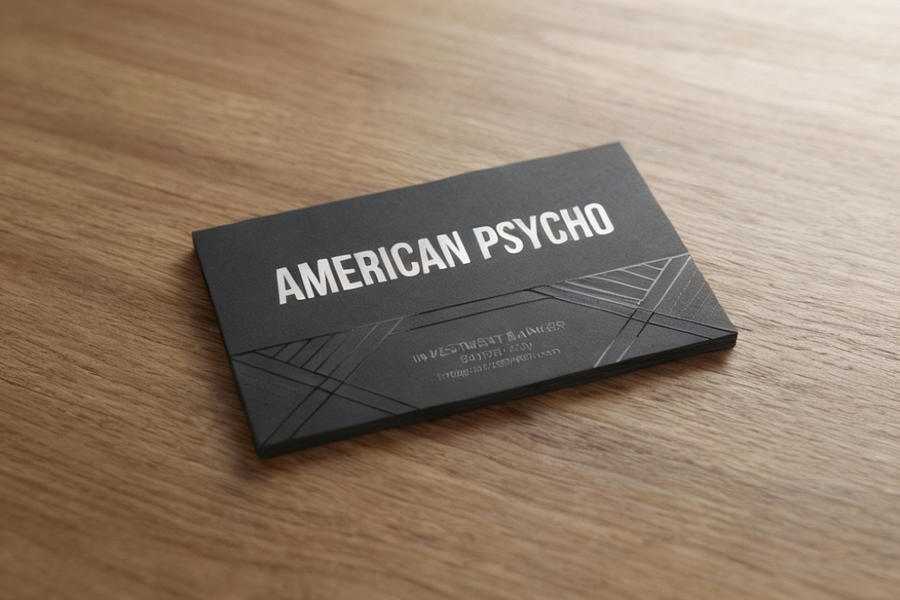
Introduction to the American Psycho Business Card
The American Psycho business card scene is one of the most iconic moments in cinema. In just three minutes, the film transformed simple corporate cards into cultural symbols of vanity, rivalry, and obsession. Among them, Paul Allen’s Pierce & Pierce card remains the most requested design, admired for its subtle elegance and professional layout.
Why Is the American Psycho Business Card Famous?
The scene shows Patrick Bateman and his colleagues comparing cards with obsessive detail. Each card represents status, taste, and identity. Subtle differences in paper color, typeface, and printing style spark envy and competition, turning ordinary stationery into symbols of power.
Breakdown of the Cards
Patrick Bateman’s Card
- Paper: “Bone” colored stock.
- Typeface: Fictional “Silian Rail,” actually Garamond Classico SC.
- Issues: Off‑center alignment, tight margins, typo in “acquisitions.”
- Strengths: Letterpress printing with visible impression, timeless Garamond typeface.
David Van Patten’s Card
- Paper: Eggshell textured stock.
- Typeface: Bodoni.
- Issues: Set too high, flat offset printing.
- Strengths: Modern feel with strong 1980s corporate vibe.
Timothy Bryce’s Card
- Paper: Pale nimbus white.
- Typeface: Helvetica.
- Issues: Set too low, uninspired design.
- Strengths: Clean, contemporary, letterpress impression.
Paul Allen’s Card
- Paper: Smooth, off‑white stock.
- Typeface: Copperplate Gothic.
- Strengths: Balanced layout, tasteful thickness, professional serif typeface.
- Unique Feature: Contact details split across two lines.
- Cultural Impact: The most admired card, often recreated by fans and designers.
Luis Carruthers’ Card
- Paper: Two‑color design with green ink and gold foil.
- Typeface: Edwardian Medium Plain.
- Issues: Poor registration of gold foil, flashy but unrefined.
- Strengths: Distinctive, expensive look, though considered garish.
Why Do People Love the American Psycho Business Card?
- Celebrity Status: The scene elevated ordinary business cards into pop culture icons.
- Design Flexibility: Each card balances name prominence with contact details.
- Professional Appeal: The layouts are adaptable across industries.
- Novelty Factor: Owning or recreating these cards connects fans to the film’s legacy.
Comparison of the American Psycho Business Cards
| Character | Paper Color / Texture | Typeface | Printing Style | Strengths | Weaknesses |
| Patrick Bateman | Bone, smooth | Garamond Classico SC | Letterpress | Timeless typeface, strong print | Off‑center, typo |
| David Van Patten | Eggshell, textured | Bodoni | Offset | Modern vibe, corporate feel | Flat print, poor alignment |
| Timothy Bryce | Pale nimbus white | Helvetica | Letterpress | Clean, contemporary | Too low, uninspired |
| Paul Allen | Off‑white, smooth | Copperplate Gothic | Letterpress | Balanced, elegant, admired | No watermark, subtle flaws |
| Luis Carruthers | Green + gold foil | Edwardian Plain | Foil + ink | Flashy, distinctive | Poor registration, garish look |
FAQs
1. What is the American Psycho business card?
It refers to the Pierce & Pierce cards featured in the 2000 film American Psycho.
2. Why is Paul Allen’s card the most popular?
It is admired for its subtle off‑white coloring, tasteful thickness, and Copperplate Gothic typeface.
3. What typeface is used in Patrick Bateman’s card?
The film calls it “Silian Rail,” but it is actually Garamond Classico SC.
4. Is Timothy Bryce’s card embossed?
No. Despite his claim of “raised lettering,” the card is letterpress printed.
5. Why do fans recreate these cards?
They symbolize status, design obsession, and pop culture nostalgia, making them collectible items.
Key Takeaways
- The American Psycho business card scene transformed simple corporate cards into cultural icons.
- Each card reflects its owner’s personality, from Patrick Bateman’s flawed Garamond design to Paul Allen’s admired Copperplate Gothic layout.
- Fans continue to request and recreate these cards, especially Paul Allen’s, due to their professional appeal and cinematic legacy.
- The cards remain a symbol of vanity, rivalry, and design obsession, making them timeless in both film and design culture.
Fast reads. Smart insights. Hit go at HomeDwellish